07 Multi Lookup
Function Overview
The Associated Multiple Selection Control refers to calling data from other forms within the current form, establishing a connection between two forms. When in use, it can associate with one or more data entries from the corresponding form.
Use Cases
For example, in the 【Order Information】form, you need to fill in order time, product number, product quantity, product amount, etc. The product number field needs to be consistent with the product numbers already entered in the 【Product Information】form. In this scenario, the product number field is the data association field, which can obtain all the “product numbers” already entered in the 【Product Information】form.
Setting Method
Simply click on the Associated Multiple Selection in the advanced fields or drag the control to the canvas to complete the addition of the control.
Widget Properties
| Widget Properties | Settings Options | Settings Options Description |
| Basic Properties | Name | Used to distinguish different widgets. |
| Display Name | Used to control whether the widget name is displayed when filling out the form. | |
| Width | Used to control the display width of the current widget when filling out the form. | |
| Placeholder | Used to guide the filler in entering content. | |
| Help Text | A question mark hover appears when filling out the form, which can display help text. | |
| Permissions | Visibility Permissions: Visible, Conditionally Visible, Invisible. Edit Permissions (precondition: visibility permissions): Editable, Non-editable. Mandatory Permissions (precondition: edit permissions): Mandatory, Conditionally Mandatory, Not Mandatory. Field permissions only take effect in non-process forms. Additionally, conditionally visible and conditionally mandatory permissions take effect in both process and non-process forms. | |
| Special Properties | Related Form | Drop-down Option (Select Form):Choose the associated form. |
| Form Field | Drop-down Option (Select Form Field):Choose the corresponding field under the associated form. | |
| Tree List | Switch,After enabling the tree display, you can select node fields as branches of the tree. Once selected, the data associated with the form will be displayed in a tree structure. Only leaf nodes are allowed to be selected: When enabled, the client can only select data without subordinates when selecting associated form data. | |
Input method
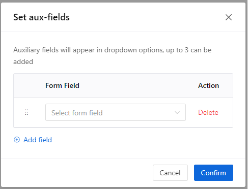
| Radio Button (Drop-down Selection, Pop-up Dialog): Drop-down Selection for Configuring Auxiliary Display Fields:
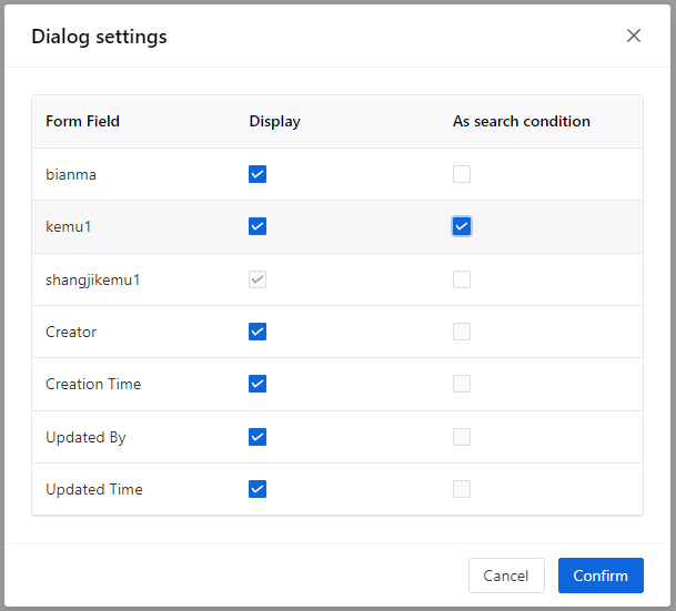
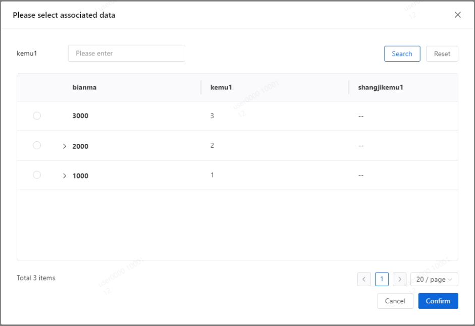
Popup Dialog Auxiliary Settings: Dialog Settings Support setting which fields are displayed in the dialog and whether they can be used as search criteria.
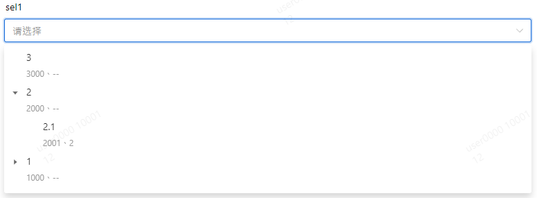
After configuration, the client-side runtime effect is as shown in the following figure.
| |
| Data Range | Set the data range that can be selected for the current form. | |
| Fetch real-time data | Switch: When enabled, the data will be refreshed each time the page is entered. | |
| Default | Automatically retrieve associated form data based on conditions. If there are multiple sets of associated form data that meet the conditions, the system will only retrieve the first one. |