
08 Date&Time
Feature Overview
The Date and Time widget is used for selecting specific dates and times.
Use Cases
It is suitable for scenarios like selecting meeting times, birthdays, expiration dates, etc.
Setting Method
Click on the Date and Time widget in the basic fields or drag and drop the Date and Time widget onto the canvas. Users can then select the date and time format.
Widget Properties
| Widget Properties | Settings Options | Settings Options Description |
| Basic Properties | Name | Used to distinguish different widgets. |
| Display Name | Used to control whether the widget name is displayed when filling out the form. | |
| Width | Used to control the display width of the current widget when filling out the form. | |
| Placeholder | Used to guide the filler in entering content. | |
| Help Text | A question mark hover appears when filling out the form, which can display help text. | |
| Permissions | Visibility Permissions: Visible, Conditionally Visible, Invisible; Edit Permissions (precondition: visibility permissions): Editable, Non-editable; Mandatory Permissions (precondition: edit permissions): Mandatory, Conditionally Mandatory, Not Mandatory; Field permissions only take effect in non-process forms; Additionally, conditionally visible and conditionally mandatory permissions take effect in both process and non-process forms. | |
| Special Properties | Time Format | Dropdown Single-Select Box, Default Value: YYYY-MM-DD HH:mm:ss As shown in the figure below: 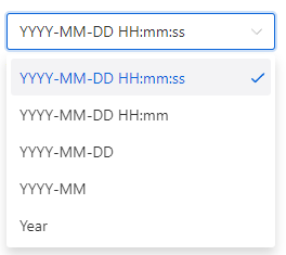 |
| Default Value(assigned only when the control is loaded for the first time) | Customization: Configure a fixed time; Formula calculation: Obtain a dynamically calculated time value through a formula function | |
| Formula value | Dynamically obtain the result calculated by the formula when the value of the control used in the formula changes, and obtain the default value based on the formula calculation | |
| Optional Range | Can dynamically set the selectable event range of this date and time widget based on the controls in the form. |